Bevy_Lunex is a blazingly fast, path-based retained layout engine designed for creating UI within the Bevy game engine.
Centered around Bevy ECS, Bevy_Lunex allows developers to manage their UI elements with the same principles and tools used for other game entities.
-
Lunex is great for:
- Making a game-like user interface
- Enjoying hands on approach
- Requiring custom widgets
- Requiring worldspace (diegetic) UI
-
Lunex is not optimal for:
- Making a dektop application (WIP)
- Wanting to make UI quickly (WIP)
Syntax Example
This is an example of a clickable Button created from scratch using predefined components. As you can see, ECS modularity is the focus here. The library will also greatly benefit from upcoming BSN (Bevy Scene Notation) addition that Cart is working on.
#![allow(unused)] fn main() { commands.spawn(( // #=== UI DEFINITION ===# // This specifies the name and hierarchy of the node UiLink::<MainUi>::path("Menu/Button"), // Here you can define the layout using the provided units (per state like Base, Hover, Selected, etc.) UiLayout::window().pos(Rl((50.0, 50.0))).size((Rh(45.0), Rl(60.0))).pack::<Base>(), // #=== CUSTOMIZATION ===# // Give it a background image UiImage2dBundle { texture: assets.load("images/button.png"), ..default() }, // Make the background image resizable ImageScaleMode::Sliced(TextureSlicer { border: BorderRect::square(32.0), ..default() }), // This is required to control our hover animation UiAnimator::<Hover>::new().forward_speed(5.0).backward_speed(1.0), // This will set the base color to red UiColor<Base>::new(Color::RED), // This will set hover color to yellow UiColor<Hover>::new(Color::YELLOW), // #=== INTERACTIVITY ===# // This is required for hit detection (make it clickable) PickableBundle::default(), // This will change cursor icon on mouse hover OnHoverSetCursor::new(CursorIcon::Pointer), // If we click on this, it will emmit UiClick event we can listen to UiClickEmitter::SELF, )); }
^^^ Source from Bevypunk repo
Key Features
-
Path-Based Hierarchy: Bevy_Lunex utilizes its own custom hierarchy alongside Bevy's default hierarchy. This approach circumvents the borrow checking rules enforced by Rust, which can obstruct the ability to access data fluidly. This is achieved by introducing an iterable, hashmap-like "god" struct (
UiTree
component) that contains all the UI data. Developers navigate this structure using a syntax reminiscent of Unix file systems, such as"foo/bar"
, to retrieve specific data or bind entities to it. -
Retained UI: Most UI frameworks for Bevy operate on an immediate mode basis, recalculating every tick. In contrast, Bevy_Lunex employs a retained mode, meaning that the UI state is stored and only recomputed when changes occur. This results in improved performance and reduced energy consumption, making Bevy_Lunex an efficient choice for UI development.
-
ECS Friendly: Traditional UI frameworks often impose special rules on UI entities, isolating them from the rest of the application's logic. Bevy_Lunex adopts a different approach, treating UI entities as regular game entities. By leveraging the
Transform
component, any entity, including 3D models, can be integrated into the layout engine. This design ensures seamless interaction and uniform behavior across all entities in the application. -
Resizable Layouts: As a game-first UI framework, Bevy_Lunex is designed to support all aspect ratios and resolutions out of the box. UI layouts automatically adapt to different window sizes without collapsing or requiring explicit instructions for various circumstances. For instance, a UI designed for a 1920x1080 pixel window will maintain its layout proportionally when scaled down to a 1280x720 pixel window, simply appearing smaller. This behavior is ideal for games, though it may differ from traditional HTML-based layouts. For regular applications requiring different behavior, the
Div
layout (currently a work in progress) is recommended.
Comparison with bevy_ui
While bevy_ui
offers a straightforward approach to UI creation within Bevy, Bevy_Lunex provides a more advanced and hands-on alternative. Additionally, the ability to integrate both 2D and 3D elements and the seamless extension of UI behavior through ECS components make Bevy_Lunex a powerful tool for developers aiming to create sophisticated and stylized user interfaces.
Installation
Installing Bevy_Lunex
is straightforward, just like any other Rust crate.
Add the following to your Cargo.toml
:
[dependencies]
bevy_lunex = { version = "0.2.0" }
Alternatively, you can use the latest bleeding edge version from the Git repository:
[dependencies]
bevy_lunex = { git = "https://github.com/bytestring-net/bevy_lunex" }
Bevy
To avoid potential conflicts with bevy_ui
, you can disable the default features and enable them manually. This prevents mixing different UI crates and reduces confusion. Refer to Bevy's Cargo.toml file for the complete list of features.
Add the following to your Cargo.toml
:
bevy = { version = "0.14.0", default_features = false, features = [
# Core
"bevy_core_pipeline",
"multi_threaded",
"bevy_winit",
"bevy_audio",
"bevy_sprite",
"bevy_text",
# Core formats
"vorbis",
"png",
# ... Enable what you need here
] }
Quick start
Explanation
Lunex works by first creating an entity that will contain the future UI. This entity is called UiTree
and has a component with the same name. Afterwards, any entity that will be part of that UI needs to be spawned as it's child.
Boilerplate
#![allow(unused)] fn main() { use bevy_lunex::prelude::*; }
Then we need to add UiPlugin
to our app.
fn main() { App::new() .add_plugins((DefaultPlugins, UiPlugin)) .run(); }
Thats it for the boilerplate!
Start
Because the library supports a lot of different use cases, we need to specify what dimensions will the UI be rendered with.
Right now we want to use the window size, so we will use the default marker component and add it to our camera.
This will make the camera pipe it's size into our future UiTree
which also needs to have the same marker applied.
#![allow(unused)] fn main() { commands.spawn(( // Add this marker component provided by Lunex. MainUi, // Our camera bundle with depth 1000.0 because UI starts at `0` and goes up with each layer. Camera2dBundle { transform: Transform::from_xyz(0.0, 0.0, 1000.0), ..default() } )); }
Now we need create our UiTree
entity. The core components are UiTree
+ Dimension
+ Transform
. The UiTreeBundle
already contains these components for our ease of use.
The newly introduced Dimension
component is used as the source size for the UI system. We also need to add the MovableByCamera
component so our entity will receive updates from camera. The last step is adding the default MainUi
marker as a generic.
#![allow(unused)] fn main() { commands.spawn(( // This makes the UI entity able to receive camera data MovableByCamera, // This is our UI system UiTreeBundle::<MainUi>::from(UiTree::new("Hello UI!")), )).with_children(|ui| { // Here we will spawn our UI as children }); }
Now, any entity with UiLayout
+ UiLink
spawned as a child of the UiTree
will be managed as a UI entity. If it has a Transform
component, it will get aligned based on the UiLayout
calculations taking place in the parent UiTree
. If it has a Dimension
component then its size will also get updated by the UiTree
output. This allows you to create your own systems reacting to changes in Dimension
and Transform
components.
You can add a UiImage2dBundle
to the entity to add images to your widgets. Or you can add another UiTree
as a child, which will use the computed size output in Dimension
component instead of a Camera
piping the size to it.
The generic in pack::<S>()
represents state. For now leave it at Base
, but when you for example later want to add hover animation use Hover
instead.
#![allow(unused)] fn main() { ui.spawn(( // Link the entity UiLink::<MainUi>::path("Root"), // Specify UI layout UiLayout::window_full().pos(Ab(20.0)).size(Rl(100.0) - Ab(40.0)).pack::<Base>(), )); ui.spawn(( // Link the entity UiLink::<MainUi>::path("Root/Rectangle"), // Specify UI layout UiLayout::solid().size(Ab((1920.0, 1080.0))).pack::<Base>(), // Add image to the entity UiImage2dBundle::from(assets.load("background.png")), )); }
UiLink
is what is used to define the the custom hierarchy. It uses /
as the separator. If any of the names don't internally exist inside the parent UiTree
, it will create them.
As you can see in the terminal (If you have enabled debug
feature or added the UiDebugPlugin
), the structure looks like this:
#![allow(unused)] fn main() { > MyUiSystem == Window [pos: (x: 0, y: 0) size: (x: 100%, y: 100%)] |-> Root == Window [pos: (x: 20, y: 20) size: (x: -40 + 100%, y: -40 + 100%)] | |-> Rectangle == Solid [size: (x: 1920, y: 1080) align_x: 0 align_y: 0] }
Debug
Lunex offers great debugging functionality. To enable these features, enable debug
feature or add the following plugin:
#![allow(unused)] fn main() { App::new() .add_plugins(UiDebugPlugin::<MainUi>::new()) .run(); }
This will draw gizmo outlines around all your nodes, allowing you to see their positions and sizes.
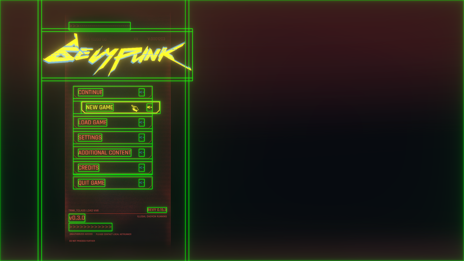
Additionally, it will print the UiTree
to the console whenever a change is detected. This can be extremely useful for debugging your UI.
#![allow(unused)] fn main() { > MainMenu == Window [pos: (x: 0, y: 0) size: (x: 100%, y: 100%) anchor: TopLeft] |-> Background == Solid [size: (x: 2968, y: 1656) align_x: 0 align_y: 0] |-> Solid == Solid [size: (x: 881, y: 1600) align_x: -0.74 align_y: 0] | |-> Board == Window [pos: (x: 50%, y: 0) size: (x: 105%, y: 105%) anchor: TopCenter] | | |-> CONTINUE == Window [pos: (x: 0, y: 0) size: (x: 100%, y: 14%) anchor: TopLeft] | | |-> NEW GAME == Window [pos: (x: 0, y: 17%) size: (x: 100%, y: 14%) anchor: TopLeft] | | |-> LOAD GAME == Window [pos: (x: 0, y: 34%) size: (x: 100%, y: 14%) anchor: TopLeft] | | |-> SETTINGS == Window [pos: (x: 0, y: 51%) size: (x: 100%, y: 14%) anchor: TopLeft] | | |-> ADDITIONAL CONTENT == Window [pos: (x: 0, y: 68%) size: (x: 100%, y: 14%) anchor: TopLeft] | | |-> CREDITS == Window [pos: (x: 0, y: 85%) size: (x: 100%, y: 14%) anchor: TopLeft] | | |-> QUIT GAME == Window [pos: (x: 0, y: 102%) size: (x: 100%, y: 14%) anchor: TopLeft] }
And this will also output detailed information to the console, which can be useful if you are integrating custom logic into the system.
#![allow(unused)] fn main() { INFO bevy_lunex::systems: -> UiTree - Fetched Transform data from Camera INFO bevy_lunex::systems: <> UiTree - Recomputed INFO bevy_lunex::systems: <- Foo/Bar - Linked ENTITY fetched Dimension data from node INFO bevy_lunex::systems: <- Foo/Bar - Linked ELEMENT fetched Transform data INFO bevy_lunex::systems: -- ELEMENT - Piped Dimension into sprite size }
Linking
Lunex is somewhat similar to bevy_rapier
, as it involves synchronizing with a separate World
. This world is none other than the UiTree
component. All UI data from its children are aggregated and synchronized into this "god-struct" that handles the layout computation.
Under the Hood
What is UiTree
under the hood, then? It is a specially modified hashmap variant called NodeTree
. Its inner structure is almost identical to how your operating system storage works. You can think of NodeTree
as an empty storage drive. You can insert so-called Nodes
, which would be directories/folders in this analogy. Into each "folder," you can insert only one "file" (which is UI layout data in this case) and an unlimited number of nested subnodes.
Let's analyze this:
#![allow(unused)] fn main() { > MyUiSystem == Window [pos: (x: 0, y: 0) size: (x: 100%, y: 100%)] |-> Root == Window [pos: (x: 0, y: 0) size: (x: 100%, y: 100%)] | |-> Rectangle == Solid [size: (x: 1920, y: 1080) align_x: 0 align_y: 0] }
These are actually NOT entities but the so-called "NodeTree file system" printed out. It is inspired by GNU/Linux's tree
command, which does exactly the same thing.
So "MyUiSystem"
is your UiTree name, and its root layout is by default set to window_full()
. Then you can see that this UiTree
has a subnode called "Root"
, which is created like this:
#![allow(unused)] fn main() { ui.spawn(( UiLink::<MainUi>::path("Root"), // Here we define the name of the node UiLayout::window_full().pack::<Base>(), // This is where we define the layout )); }
Once this entity is created and picked up by Lunex, it creates the specific "directory"
in the parent UiTree
and then sends the corresponding data like layout with it as well. Once all data are prepared, Lunex will compute the correct layouts and send back this information to these "linked entities".
Nesting
At some point, you will want to create a UI node inside another one. HTML does this too, but it is derived from syntax, like this:
<div>
<div /> // This div is inside the other div
</div>
You want this because the inner divs will affect the size of the outer div. In Lunex, you can nest by specifying a path. The /
separator is used for this. This will create a "Rectangle"
node inside of "Root"
, as shown in the top tree printout.
#![allow(unused)] fn main() { ui.spawn(( UiLink::<MainUi>::path("Root/Rectangle"), // Here we define the name of the node UiLayout::window_full().pack::<Base>(), )); }
But writing each path manually is not optimal. What if you want to change the structure? Will you change the paths of all the nodes then? Of course not.
#![allow(unused)] fn main() { let root = UiLink::<MainUi>::path("Root"); // Here we create the node link and store it ui.spawn(( root.clone(), // Here we add the link UiLayout::window_full().pack::<Base>(), // This is where we define the layout )); ui.spawn(( root.add("Background"), // We use the existing "root" link to create a chained link (same as "Root/Background") UiLayout::window_full().pack::<Base>(), // This is where we define the layout )); }
Which hierarchy to use
You will always want to use the Lunex hierarchy for all entities that should fall in the same UI system. We use Bevy's built-in hierarchy only to abstract our UI away, so we don't need to think about it.
Layouts
There are multiple layouts that you can utilize to achieve the structure you are aiming for.
Boundary
Defined by point1 and point2, it is not influenced by UI flow and is absolutely positioned.
- pos1 - Position of the top-left corner
- pos2 - Position of the bottom-right corner
This will make a node start at 20%
and end at 80%
on both axis from the parent node.
#![allow(unused)] fn main() { UiLayout::boundary() .pos1(Rl(20.0)) .pos2(Rl(80.0)) .pack::<Base>() }
Window
Defined by position and size, it is not influenced by UI flow and is absolutely positioned.
- pos - Position of the node
- anchor - The origin point relative to the rest of the node
- size - Size of the node
This will make a node centered at x: 53%
, y: 15%
and with size width: 60%
and height: 65%
.
#![allow(unused)] fn main() { UiLayout::window() .pos(Rl((53.0, 15.0))) .anchor(Anchor::Center) .size(Rl((60.0, 65.0))) .pack::<Base>() }
Solid
Defined by size only, it will scale to fit the parenting node. It is not influenced by UI flow.
- size - Aspect ratio, it doesn't matter if it is
(10, 10)
or(100, 100)
- align_x - Horizontal alignment,
-1.0 to 1.0
with0.0
as default - align_y - Vertical alignment,
-1.0 to 1.0
with0.0
as default - scaling - If the container should
fit
inside parent orfill
the parent
This layout is ideal for images, because it preserves aspect ratio under all costs.
Here we will set aspect ratio to the size of our imaginary texture (881.0, 1600.0)
in pixels.
Then we can align it horizontally.
#![allow(unused)] fn main() { UiLayout::solid() .size((881.0, 1600.0)) .align_x(-0.74) .pack::<Base>(), }
Div
Coming soon...
Units
Lunex features 9 different UI units, which are used as arguments for UiValue<T>
. The T
is expected to be f32
, Vec2
, Vec3
or Vec4
. They are used in layout functions where impl Into<UiValue<T>>
is specified as argument.
Ab
- Stands for absolute, usuallyAb(1)
= 1pxRl
- Stands for relative, it meansRl(1.0)
== 1%Rw
- Stands for relative width, it meansRw(1.0)
== 1%w, but when used in height field, it will use width as sourceRh
- Stands for relative height, it meansRh(1.0)
== 1%h, but when used in width field, it will use height as sourceEm
- Stands for size of symbol M, it meansEm(1.0)
== 1em, so size 16px if font size is 16pxSp
- Stands for remaining space, it's used as proportional ratio between margins, to replace alignment and justification. Only used byDiv
Vp
- Stands for viewport, it meansVp(1.0)
== 1v% of theUiTree
original sizeVw
- Stands for viewport width, it meansVw(1.0)
== 1v%w of theUiTree
original size, but when used in height field, it will use width as sourceVh
- Stands for viewport height, it meansVh(1.0)
== 1v%h of theUiTree
original size, but when used in width field, it will use height as source
Basic Operations
All unit types implement basic mathematical operations:
#![allow(unused)] fn main() { let a: Ab<f32> = Ab(4.0) + Ab(6.0); // -> 10px let b: Ab<f32> = Ab(4.0) * 2.0; // -> 8px }
You can also combine different unit types:
#![allow(unused)] fn main() { let a: UiValue<f32> = Ab(4.0) + Rl(6.0); // -> 4px + 6% }
If a unit is unspecified, the f32
value is considered to be in Ab
unit:
#![allow(unused)] fn main() { let a: Ab<f32> = 5.0.into(); // -> 5px }
Vector Definitions
You can easily define vectors using these units:
#![allow(unused)] fn main() { let a: UiValue<Vec2> = Ab(10.0).into(); // -> [10px, 10px] let b: UiValue<Vec2> = Ab((10.0, 15.0)).into(); // -> [10px, 15px] let c: UiValue<Vec2> = (Ab(10.0), Rl(5.0)).into(); // -> [10px, 5%] }
Works for larger vectors like Vec3
and Vec4
the same.
If you put them as arguments to impl Into<UiValue<T>>
, you don't have to call .into()
.
Cursor
Lunex provides a custom API for a cursor within your Bevy application.
This feature works by spawning a cursor atlas image alongside a special Cursor2d
component as a child of a 2D camera.
To use the custom cursor styling, we need to expand our Camera2d
entity as follows:
#![allow(unused)] fn main() { fn setup(mut commands: Commands, assets: Res<AssetServer>, mut atlas_layout: ResMut<Assets<TextureAtlasLayout>>){ commands.spawn(( MainUi, Camera2dBundle { transform: Transform::from_xyz(0.0, 0.0, 1000.0), ..default() } )).with_children(|camera| { // Spawn cursor camera.spawn (( // Here we can map different native cursor icons to texture atlas indexes and sprite offsets Cursor2d::new().native_cursor(false) .register_cursor(CursorIcon::Default, 0, (14.0, 14.0)) .register_cursor(CursorIcon::Pointer, 1, (10.0, 12.0)) .register_cursor(CursorIcon::Grab, 2, (40.0, 40.0)), // Add texture atlas to the cursor TextureAtlas { layout: atlas_layout.add(TextureAtlasLayout::from_grid(UVec2::splat(80), 3, 1, None, None)), index: 0, }, // Add sprite bundle to the cursor SpriteBundle { texture: assets.cursor.clone(), transform: Transform { scale: Vec3::new(0.45, 0.45, 1.0), ..default() }, sprite: Sprite { color: Color::BEVYPUNK_YELLOW.with_alpha(2.0), anchor: Anchor::TopLeft, ..default() }, ..default() }, // Make the raycaster ignore this entity, we don't want our cursor to block clicking Pickable::IGNORE, )); }); } }
When creating a Cursor2d
component, you can use the native_cursor()
method to specify whether the cursor should exist as an entity within the game world or be injected into the Winit
crate as a custom cursor sprite. (Note: This feature is currently a work in progress, and enabling it only hides the sprite for now.)
By default, spawning the cursor entity will hide the native system cursor unless native_cursor(true)
is set.
Additionally, you must register each cursor icon with its respective texture atlas indices and sprite offsets to define the appearance and positioning of different cursor states.
Finally, to prevent the cursor from interfering with clicking events, we add the Pickable::IGNORE
component. This ensures that the cursor sprite does not block any button interactions or other clickable elements in the UI.
Cursor position
You can query for GlobalTransform
of Cursor2d
to get it's worldspace location. For localspace, use regular Transform
.
Text
To render text, you use UiText2dBundle
together with Window
layout.
All you have to do is specify the position and the anchor of the text node.
You can disregard any size parameters, as they get overwritten by text-size.
For text-size, the provided font_size
parameter is used, but instead of pixels it becomes Rh
unit.
Currently it is hardcoded, but in the future you will be able to specify which unit to use.
#![allow(unused)] fn main() { // Link this widget UiLink::<MainButtonUi>::path("Text"), // Here we can define where we want to position our text within the parent node, // don't worry about size, that is picked up and overwritten automaticaly by Lunex to match text size. UiLayout::window().pos(Rl((5., 50.))).anchor(Anchor::CenterLeft).pack::<Base>(), // Add text UiText2dBundle { text: Text::from_section("Hello world!", TextStyle { font: assets.load("font.ttf"), font_size: 60.0, // Currently hardcoded as Relative height (Rh) - so 60% of the node height color: Color::RED, }), ..default() }, }
Abstraction
As your user interface grows, it can become unmanageable. To address this, we will abstract our UI into higher-level components. This approach helps maintain organization and scalability.
Project Structure
I recommend setting up your project with a structure similar to the following:
src
|-- components
| |-- mod.rs
| |-- custom_button.rs
|-- routes
| |-- mod.rs
| |-- my_route.rs
|-- main.rs
We will create components
and routes
folders to contain our higher-level components. Each abstraction will have its own .rs
file.
Setting Up Components
In components/mod.rs
, we will aggregate all respective component plugins into a single plugin.
#![allow(unused)] fn main() { // components/mod.rs pub mod custom_button; pub use custom_button::*; // #=== ROUTE PLUGIN ===# use bevy::prelude::*; pub struct ComponentPlugin; impl Plugin for ComponentPlugin { fn build(&self, app: &mut App) { app // Add each component plugin .add_plugins(CustomButtonPlugin); } } }
Similarly, routes/mod.rs
will aggregate all route plugins.
#![allow(unused)] fn main() { // routes/mod.rs pub mod my_route; pub use my_route::*; // #=== ROUTE PLUGIN ===# use bevy::prelude::*; pub struct RoutePlugin; impl Plugin for RoutePlugin { fn build(&self, app: &mut App) { app // Add each route plugin .add_plugins(MyRoutePlugin); } } }
Finally, ensure these plugins are added in your main.rs
.
// main.rs mod components; mod routes; pub use bevy::prelude::*; pub use bevy_lunex::prelude::*; pub use {components::*, routes::*}; fn main() { App::new() .add_plugins((DefaultPlugins, UiPlugin)) .add_plugins(ComponentPlugin) .add_plugins(RoutePlugin) .run(); }
With this project structure in place, you can now focus on creating reusable components, making your codebase more organized and maintainable.
Components
Components (Not Bevy ECS componets, but UI components) bundle certain UI behavior under a single entity. Example can be Button, Text input, Calendar, Minimap, etc.
Creating a Component
Begin by creating a new .rs
file in the components
folder. First, define a public component that will serve as the abstraction.
#![allow(unused)] fn main() { // components/custom_button.rs /// When this component is added, a UI system is built #[derive(Component)] pub struct CustomButtom { // Any fields we want to interact with should be here. text: String, } }
Best practice is that all components should be sandboxed. For that reason we need to define a new marker component, that will be used ONLY for UI inside this button component (instead of MainUi
).
#![allow(unused)] fn main() { // components/custom_button.rs /// Marker struct for the sandboxed UI #[derive(Component)] struct CustomButtonUi; }
Next, create a system that builds the component UI when the component is added. This system will insert the UiTree
component into the same entity and spawn the UI elements as children.
#![allow(unused)] fn main() { // components/custom_button.rs /// System that builds the route when the component is added fn build_route(mut commands: Commands, assets: Res<AssetServer>, query: Query<Entity, Added<CustomButtom>>) { for entity in &query { commands.entity(entity).insert(( // Insert this bundle into the entity that just got the CustomButtom component // Note that CustomButtonUi is used here instead of MainUi UiTreeBundle::<CustomButtonUi>::from(UiTree::new("CustomButton")), // Now spawn the UI as children )).with_children(|ui| { // Spawn some UI nodes ui.spawn(( // Link this widget // Note that CustomButtonUi is used here instead of MainUi UiLink::<CustomButtonUi>::path("Image"), // Add layout UiLayout::window_full().pack::<Base>(), // Give it a background image UiImage2dBundle { texture: assets.load("images/button.png"), sprite: Sprite { color: Color::RED, ..default() }, ..default() }, // Give the texture 9-slice tilling ImageScaleMode::Sliced(TextureSlicer { border: BorderRect::square(32.0), ..default() }), )) }); } } }
Finally, add the system to a plugin.
#![allow(unused)] fn main() { // components/custom_button.rs pub struct CustomButtonPlugin; impl Plugin for CustomButtonPlugin { fn build(&self, app: &mut App) { app // Add Lunex plugins for our sandboxed UI .add_plugins(UiGenericPlugin::<CustomButtonUi>::new()) // NOTE! Systems changing the UI need to run before UiSystems::Compute // or they will not get picked up by change detection. .add_systems(Update, build_route.before(UiSystems::Compute)); } } }
Don't forget to add this plugin in component/mod.rs
.
Spawning a component
To spawn the component, you have to spawn it as UI node of another UI system, either a route or another component.
#![allow(unused)] fn main() { // Spawning the component ui.spawn(( UiLink::<MainUi>::path("Button"), UiLayout::window().size(Rl(50.0)).pack::<Base>(), CustomButton { text: "PRESS ME!".to_string(), }, )); }
To despawn the component, call .despawn_recursive
on the spawned entity.
#![allow(unused)] fn main() { // Despawning the component commands.entity(component_entity).despawn_recursive(); }
Routes
In the context of a user interface, a "route" refers to a specific page of content, similar to HTML. Examples of routes might include the Main Menu, Settings, Inventory, etc.
Creating a Route
Begin by creating a new .rs
file in the routes
folder. First, define a public component that will serve as the abstraction for the route.
#![allow(unused)] fn main() { // routes/my_route.rs /// When this component is added, a UI system is built #[derive(Component)] pub struct MyRoute; }
Next, create a system that builds the route when the component is added. This system will insert the UiTree
component into the same entity and spawn the UI elements as children.
#![allow(unused)] fn main() { // routes/my_route.rs /// System that builds the route when the component is added fn build_route(mut commands: Commands, assets: Res<AssetServer>, query: Query<Entity, Added<MyRoute>>) { for route_entity in &query { // Make our route a spatial entity commands.entity(route_entity).insert( SpatialBundle::default() ).with_children(|route| { // Spawn some additional non UI components if you need to. // Here you can spawn the UI route.spawn(( UiTreeBundle::<MainUi>::from(UiTree::new("MyRoute")), MovableByCamera, )).with_children(|ui| { // Spawn some UI nodes ui.spawn(( UiLink::<MainUi>::path("Background"), UiLayout::solid().size((1920.0, 1080.0)).scaling(Scaling::Fill).pack::<Base>(), UiImage2dBundle::from(assets.load("images/background.png")), )); }); }); } } }
Lastly, add the system to a plugin.
#![allow(unused)] fn main() { // routes/my_route.rs pub struct MyRoutePlugin; impl Plugin for MyRoutePlugin { fn build(&self, app: &mut App) { app // NOTE! Systems changing the UI need to run before UiSystems::Compute // or they will not get picked up by change detection. .add_systems(Update, build_route.before(UiSystems::Compute)); } } }
Don't forget to add this plugin in routes/mod.rs
.
Spawning a route
To spawn the route, simply call:
#![allow(unused)] fn main() { // Spawning the route commands.spawn(MyRoute); }
To despawn the route, call .despawn_recursive
on the spawned entity.
#![allow(unused)] fn main() { // Despawning the route commands.entity(route_entity).despawn_recursive(); }
With this setup, you can effectively manage different UI routes within your application, keeping your codebase organized and maintainable.
Interactivity
Lunex implements its interactivity on top of Bevy_mod_picking
. If you need more control over interactions, consider researching this crate.
Interactivity is achieved by utilizing Events and Systems. Lunex provides several components to simplify the process. First, ensure your entity is pickable by adding PickableBundle
for entities with sprites or meshes, and UiZoneBundle
for entities without.
To block picking, set Pickable::IGNORE
on non-UI entities.
#![allow(unused)] fn main() { // Make it non-obsructable for hit checking (mouse detection) Pickable::IGNORE, }
To check for mouse clicks, listen to UiClickEvent
in your systems using the following code:
#![allow(unused)] fn main() { fn button_click_system(mut events: EventReader<UiClickEvent>, query: Query<&CustomButton>) { for event in events.read() { if let Ok(button) = query.get(event.target) { info!("Pressed button: {}", button.text); } } } }
Note that UiClickEvent
is not emitted automatically; you need to add the component to emit this event when Pointer<Down>
is triggered if you decide to make your own components.
#![allow(unused)] fn main() { // If we click on this node, it will emmit UiClick event on itself UiClickEmitter::SELF, // If we click on this node, it will emmit UiClick event from specified entity UiClickEmitter::new(entity), }
This component is really useful when creating complex components. You want UiClickEvent
to be emmited from the top entity in a component, so users can listen to them. This component allows you to do exactly that.
Another components that might prove useful are:
#![allow(unused)] fn main() { // If it detects UiClick event for this entity it will despawn the specified entity, great for despawning routes OnUiClickDespawn::new(entity), // If it detects UiClick event for this entity it will run the closure, great for spawning routes OnUiClickCommands::new(|commands| { commands.spawn(MyRoute); }) }
Animation
Currently, the library supports only a single type of animation from Base
-> Hover
. However, this will change in the future as the animation framework has already been laid out and just needs to be implemented for all states.
To add hover animation to a UI node, you can utilize the following component:
#![allow(unused)] fn main() { UiAnimator::<Hover>::new().forward_speed(5.0).backward_speed(1.0) }
With this component in place, you can then specify different UI properties using state generics, such as:
#![allow(unused)] fn main() { // Set base color to red UiColor::<Base>::new(Color::RED), // Set hover color to yellow UiColor::<Hover>::new(Color::YELLOW), }
You can also tween between two different layout positions by defining the hover layout like this:
#![allow(unused)] fn main() { // Hover layout specification UiLayout::window_full().x(Rl(10.0)).pack::<Hover>(), // Required to tween between states UiLayoutController::default(), }
When you need to synchronize animations on different nodes, consider using the pipe component that sends data to a specified entity:
#![allow(unused)] fn main() { // Pipe hover data to the specified entities UiAnimatorPipe::<Hover>::new(vec![text, image]), }
To receive this animation, make sure the specified entities have animator set to receiver mode:
#![allow(unused)] fn main() { UiAnimator::<Hover>::new().receiver(true), }
2D & 3D
When creating a game with both 2D and 3D elements, you may want to combine these two worlds for better visual effects or more engaging gameplay.
This can be useful for example in first-person shooters that require heads-up displays (HUDs) to display information about the player.
To achieve this fusion of 2D and 3D, you'll need to follow these steps:
1. Set up a 2D camera
First, set up your project like any other 2D setup.
#![allow(unused)] fn main() { commands.spawn( MainUi, Camera2dBundle { transform: Transform::from_xyz(0.0, 0.0, 1000.0), ..default() } ); }
2. Create a texture
Next, create a texture with the size of your viewport that will serve as the rendering target for your 3D camera.
#![allow(unused)] fn main() { // Create a texture resource that our 3D camera will render to let size = Extent3d { width: 1920, height: 1080, ..default() }; // Create the texture let mut image = Image { texture_descriptor: TextureDescriptor { label: None, size, dimension: TextureDimension::D2, format: TextureFormat::Bgra8UnormSrgb, mip_level_count: 1, sample_count: 1, usage: TextureUsages::TEXTURE_BINDING | TextureUsages::COPY_DST | TextureUsages::RENDER_ATTACHMENT, view_formats: &[] }, ..default() }; // Initiate the image image.resize(size); // Add our texture to asset server and get a handle let render_image = asset_server.add(image); }
3. Set up your 3D camera
Then, spawn your 3D camera anywhere, specifying the target and any additional settings you require.
#![allow(unused)] fn main() { // Spawn 3D camera commands.spawn( Camera3dBundle { camera: Camera { // To make this camera run before 2D camera order: -1, // The render target handle target: render_image.clone().into(), // For transparency clear_color: ClearColorConfig::Custom(Color::rgba(0.0, 0.0, 0.0, 0.0)), ..default() }, ..default() } ); }
4. Spawn a UI node with ImageBundle
Finally, spawn a UI node with the new image texture using the UiImage2dBundle
structure.
#![allow(unused)] fn main() { // Spawn 3D camera view ui.spawn(( root.add("Camera3d"), UiLayout::solid().size((1920.0, 1080.0)).scaling(Scaling::Fill).pack::<Base>(), UiImage2dBundle::from(render_image), )); }
By following these steps, you can successfully merge the 2D and 3D worlds in your game.
Worldspace UI
Coming soon...
Custom rendering
Coming soon...
Contributors
This documentation is maintained by
Help
For issues related to the library, please create a ticket on GitHub
.
You can also reach out on the Bevy Discord
, where I am likely to see your message.
For questions or additional help, feel free to send me a direct message on Discord: @idedary
.